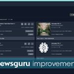
In a move poised to redefine search engine optimization and enhance user experience, Google is currently experimenting with a new layout for its AI Overviews box. Traditionally, link cards directing users to external websites have been positioned at the bottom of these overviews. However, this latest experiment places these link cards at the very top, a shift that could revolutionize user interaction with search results and significantly boost traffic for online publishers.
The initial reveal of this transformative test came from Bartosz Góralewicz, an SEO expert and founder of the tracking tool Ziptie. Góralewicz, who shared a screenshot of the new layout on X (formerly known as Twitter), pointed out the potential ramifications for various sectors. His tweet, “Google just launched a new layout of Google AIOs,” instantly ignited widespread curiosity and dialogue within the SEO community.
Google has confirmed that the new layout is indeed under testing but emphasized that it is not yet fully operational. Góralewicz noted in a follow-up tweet, “Yes, this was our logic at first, too. It seems to scale to other locations,” highlighting the test’s potential for broader implementation. He further added, “But it would actually be a nice change driving more clicks to websites (and giving Google some space to advertise).” The SEO community has largely embraced this change. Gianluca Fiorelli, an SEO consultant, remarked, “Better than using carousel or needing to open a dropdown.” Blair MacGregor, another SEO expert, humorously queried, “What’s…the point of the AIO if it’s not the first thing users see?” Meanwhile, digital marketer Brandon Wentland praised the increased prominence of citations, calling it “a big win for brands.”
The advantages of this new layout extend beyond mere aesthetics. By making relevant links more accessible, Google could significantly enhance the user experience. The new layout might also be inspired by user interface designs from competitors like Perplexity, indicating a broader trend in the industry towards more user-friendly designs. This test is being rolled out gradually, appearing in different data centers at various times, suggesting a cautious but optimistic approach by Google. This move aligns with Google’s ongoing efforts to elevate the visibility of authoritative content, a critical element in maintaining the integrity of its search results.
From an SEO perspective, the update could potentially reshape strategies, focusing more on optimizing for AI Overview appearances. There is also speculation that Google might use the extra space created by moving the link cards for advertising purposes, adding another layer of complexity to the SEO landscape. However, not all reactions have been entirely positive. Some users have expressed concerns that the new layout might prioritize certain types of content over others, potentially skewing search results. Industry experts believe that this change could lead to more competitive bidding for top link card placements, akin to how advertisers vie for top spots in traditional search results.
Ethan Lazuk, another SEO professional, likened the new layout to Perplexity’s desktop interface, noting its user-friendliness. “I like it. Reminds me of Perplexity on desktop,” he tweeted. On LinkedIn, reactions were similarly positive. Marcus Sandford described the change as “somewhat of an improvement” and “friendlier to SEO than what a lot of us feared was coming next.” Brennen Bliss simply stated, “Love this!”
The implications of this test are profound. For starters, placing link cards at the top of the AI Overviews box could dramatically increase the click-through rate for publishers, which has often been a contentious issue. SEO professionals have long debated the effectiveness of AI-generated content versus traditional search results in driving traffic. This new layout could serve as a middle ground, ensuring that AI Overviews continue to provide concise answers while also directing users to more detailed sources. Moreover, this change underscores Google’s commitment to refining its user interface based on user behavior and needs. By making link cards more prominent, Google can ensure that high-quality, authoritative content is more easily accessible, thus maintaining the integrity of its search results.
Looking ahead, several potential developments could arise from this test. If successful, Google might fully implement the new layout across all its search interfaces, leading to a significant shift in how users interact with search results. This could also prompt other search engines to adopt similar layouts, fostering a new standard in the industry. Additionally, the increased visibility of link cards could influence SEO strategies, with marketers focusing more on optimizing for AI Overview appearances. This shift might also lead to more competitive bidding for top link card placements, similar to how advertisers vie for top spots in traditional search results. Furthermore, the extra space created by moving the link cards might be used for new features or advertisements, potentially opening up new revenue streams for Google. This could also lead to further refinements in the AI Overviews, making them even more user-centric and efficient.
Google’s test of placing link cards at the top of the AI Overviews box represents a significant potential shift in search engine optimization and user experience. While still in its testing phase, the change has already garnered positive feedback from the SEO community, signaling a promising future for both users and publishers. This experiment could mark the beginning of a new era in how we interact with search engines, blending AI efficiency with the depth of traditional search results.